Arnold Rhodes
1st – The Crossing
2nd Calanais
3rd Alone
Commended –
Jake
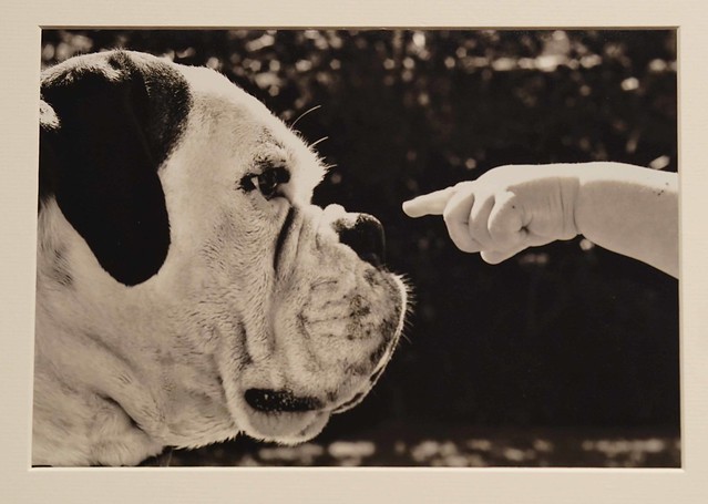
I like kids but could not eat a whole one.
Angels in the Dark
“Works well with lead in lines. Maybe a bit too light in the white areas. It is losing a bit in the white contrast. I like the photographer’s take on the building – which in my mind is hard to do with it being a hideous building”.
The Magic of Reading Charlotte’s Web
“I like the square set up used by the photographer in framing the image. Nice and sharp. Well balanced with the open book and web. Is it my eye ? Does the image have a slight dark blue tint? I looked at it in several types of natural light”.
Calanais
“ You have visited and photographed one on my wish list. I love the drama in the image. Sharp throughout. The front stone holds the image. Is it a ND filter to slow down the shutter to capture the effect on the clouds”?
Thanwde
“I do like the use of the subject looking away from the lens. Well framed and good use of a black mount to go with a B&W image. It may be my eye. Is the near (left eye) eye a slightly soft focus. I always find in portraits you are drawn to the eyes. Good catch lights in both eyes”.
The Crossing
“Love this angle of The Queensferry Crossing. Well found. Looks very dramatic as a black & white. The lead in to left is just perfectly placed. I like the sunlight catching the bridge. You get a feeling it is windy and the wispy field is blowing. I like the use of a black mount. Almost looks as if image is 3d”.
Decaying Tree
“Image fills the frame well. Nice and sharp. Not a lot in the image so hard to continue the comments”.
Alone
“The sunlight created wonderful shadows in the image. Maybe a bit tight crop on left side of pillar. Always hard to work out where to start an image like this and set tripod. I like the use of the dog walking away. Gives a sense of the scale of the image. The bend gives impression of going off into distance”.
Past Industry
“Nice image. Maybe a bit too much sky? I would have cloned out the stray twig/branch floating into image from left. The white in clouds are nicely placed to look like smoke coming from the chimney tower.
Jake
“Again, great use of a black mount. I do like when the photographer gets in very close with portraits. The child’s hood created a nice frame to the portrait. Eyes and eyelashes are pin sharp. The eyes draw you into the image as the follow you as you move”.
I like kids but couldn’t eat a whole one
“Amusing image. It definitely asks for a caption. My eyes keep being drawn to the black specs on the child’s arm. The top of the hand seems slightly blown out. It is one of these images you just have to take “now” as you can’t take time to meter read and change settings”.


Recent Comments